Color Theory for Photographers: A Primer
Originally published here. Photographs created for the article.
In 1976, the Museum of Modern Art opened an exhibition of William Eggleston’s color photographs, a show that would be remembered as a turning point in the history of photography. The press release announcing the exhibition described a new generation of photographers whose work mobilized color in new and inventive ways:
“Unlike most of their predecessors, whose color work has been either formless or too pretty, a new generation of young photographers has begun to use color in a confident spirit of freedom and naturalness. In their work the role of color is more than simply descriptive or decorative, and assumes a central place in the definition of the picture's content.”
Four decades later, it seems ridiculous that it took so long for color photography to be embraced by those buttoned-up arbiters of taste on 53rd Street. At the same time, color remains one of the most neglected formal elements of a photograph by its makers. No painter of quality creates without knowledge of color; yet there are plenty of photographers who have never picked up, let alone used, a color wheel. B&H doesn’t even sell them! Unless printing in a color darkroom, discussions of color among photographers typically begin and end with white balance, histograms, and printing profiles. The aim of this article is to begin thinking about color not simply as a descriptor but as an active ingredient in photographic composition.
A complementary palette
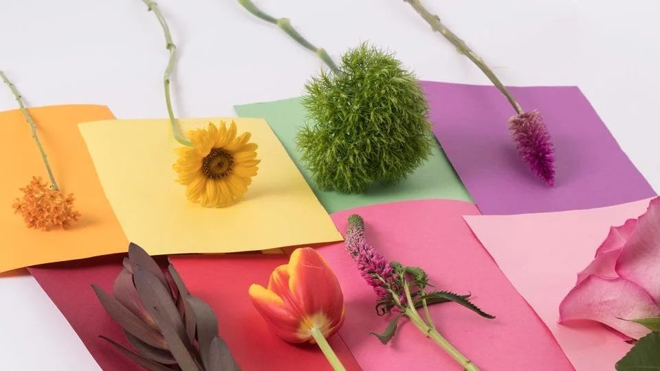
To illustrate the ideas that follow, I teamed up with my neighbors at Park Delicatessen, a flower, skateboard, and dry goods boutique, in Crown Heights, Brooklyn. Founded in 2009 by Michael Sclafani and Valentine Leung, the shop offers an eclectic selection of items, from clothing designed by Valentine and Michael to skate hardware and photography zines. Importantly, they have an ever-changing variety of beautiful and unusual flowers.

Park Delicatessen, 722 Classon Ave, Brooklyn
Why Paper?
While staring at the eight rolls of seamless paper destined for Brooklyn on my desk in Manhattan, an inevitable temptation crossed my mind: “I could just change the color of the background in Photoshop.” It’s not just that I am old-fashioned and would rather carry thirty awkward pounds of paper on the subway than spend an extra couple of hours messing around on my computer; working with physical paper adds an element of chance that is just not possible with planned simulation.
Josef Albers, one of the most influential color theorists of the 20th Century, famously made his students hunt for scraps of paper to study the interaction of different colors. In contrast to mixing paint to achieve each color, he argued that paper would allow phenomena to be easily repeated whenever a desired effect was wanted. In Albers’ spirit, I make a point of saving and labeling a scrap of seamless from every roll that I use, for future reference. Similarly, one of the cheapest yet most valuable tools that I’ve integrated into my studio practice is a color chart made by Savage, comprising physical samples of different colored background paper adhered to a foldable pamphlet. This allows me to see how a color looks without committing to a gigantic roll of paper that I ultimately may not want. It is especially useful to cut up the chart to see how the colors interact placed next to one another when building color palettes.
Experimenting with different color combinations to see what does and doesn’t work is crucial when developing palettes.
What is color?
Physicists think about color in terms of wavelengths of light. This allows each color to be a measurable phenomenon. Light that travels at a wavelength between 390 and 700nm is visible to the human eye as color. Our perception of different colors is an intensely personal experience. Color theory provides a vocabulary for negotiating these subjective phenomena. First, the basics: every color is described in terms of three properties: hue, value, and saturation.
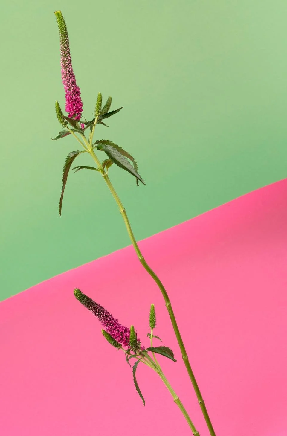
Cool palettes can create a relaxing effect.
Hue is used to describe a color (e.g. red, orange, yellow, green, blue, violet) in its natural state. It is often categorized into warm (red, orange, yellow) and cool (green, blue, violet).
Value describes the relative lightness or darkness of a color. While it is easy to distinguish value in colors of the same hue, it is much more difficult to distinguish values between colors of different hues. Converting an image to grayscale is one way to make such determinations easier. If you are familiar with the “Zone System” popularized by Ansel Adams, you have experience with distinguishing values in black-and-white photography.
Differences in value are easy to notice between colors that share the same hue.
Saturation describes the purity of a color. A fully saturated color contains no white, black, or gray; it is described as chromatic. Adding white to a hue creates a lighter value, known as a tint. Adding black to a hue creates a darker value, known as a shade. Adding gray to a hue creates a tone that may be lighter or darker depending upon the relative value of the color that you are adding it to.
Additive and Subtractive Color Systems
There are two ways that we experience color: directly (as light) and indirectly (as reflected light). When we look at a computer or phone screen, we are experiencing color directly; this is called additive color. When we look at a printed photograph or painted wall, we are experiencing color indirectly, as reflected light; this is called subtractive color.

Additive (left) and subtractive (right) color interactions.
This distinction is more than just words; it is about how colors are made. When you add more light to an additive system, color becomes lighter. Combining all colors results in white. The absence of light results in black. The opposite is true of subtractive color systems: combining all colors results in black, while the absence of color results in white. Anyone who has been disappointed by the difference in how a photograph appears on a computer screen compared to being printed on paper knows the real-world consequences of working in a medium that moves between these two systems.
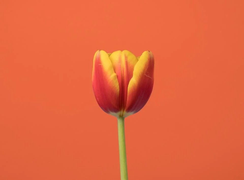
Combining two primary hues, red and yellow, produces the secondary hue, orange. A palette that utilizes these three analogous hues provides balance and stability.
Color Hierarchies and Systems
Every color system consists of primary, secondary, and tertiary hues. Primary hues are the starting point for every system. A primary hue is unique in that it cannot be made by mixing together other hues in its respective system. A secondary hue is the result of mixing two primary hues together in equal amount. A tertiary hue is the result of mixing a primary hue with an adjacent secondary hue. A color wheel is used to keep track of these relationships for additive and subtractive systems.
CMYK / RGB
In the early years of the 20th century, a new subtractive system, capable of producing a wider range of colors, was introduced and popularized by printers: CMYK (Cyan-Magenta-Yellow-Key). This is what inkjet printers use today. The CMYK system circumvents the difficulties of accomplishing pure black by including it as a separate color (Key). Finally, when working with additive color, the RGB (Red-Green-Blue) color system applies. It is worth noting that the primary colors of the RGB system are the secondary colors of CMYK, and vice versa.
Building Color Palettes
Now that we have a handle on how color is described and mixed, it is time to start thinking about how to put it to use. Any of the variables mentioned above can inform a color palette. Warm or cool hues may be combined to establish mood in a photograph, contrasting values may be juxtaposed for dramatic effect, or saturation may be used to draw attention to a particular subject.
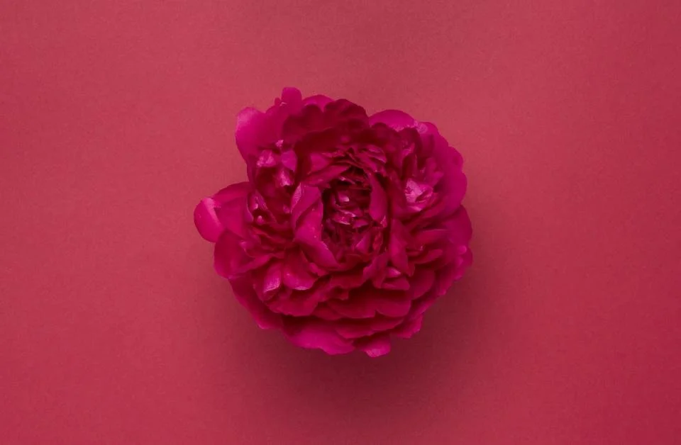
Monochromatic palettes trade contrast for uniformity.
Monochromatic palettes utilize a single hue to create a sense of balance and unity. A similar effect can be achieved by combining hues that are adjacent to one another on a color wheel, referred to as analogous. In both instances, contrast is minimized and a stable mood is established.
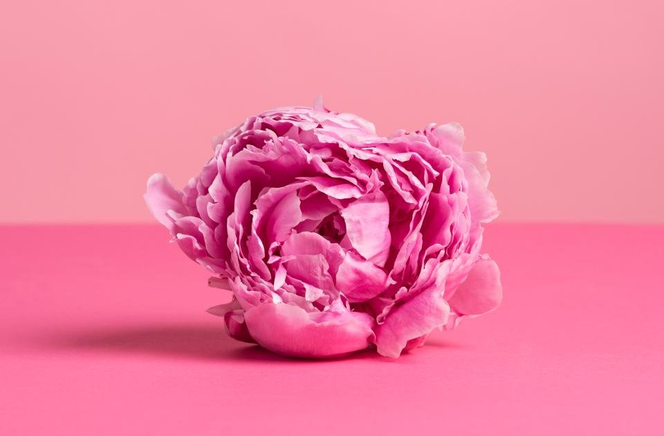
Complementary palettes tend to be bold and aggressive.
Complementary colors are two colors directly across from one another on a color wheel. Complementary colors exhibit maximum contrast and can be combined to create energetic palettes. A less extreme contrast can be achieved with a split-complementary palette, in which one color is paired with the two colors directly adjacent to its complement. For more complex scenarios, double-complementary schemes incorporating two pairs of complementary colors can be used.

Red, yellow, and blue can be combined into a triad for an effect that is simultaneously bold and ordered.
Color triads bring together three colors equidistant to one another on the color wheel to achieve an energetic but balanced effect. Similarly, tetrads combine four equidistant colors, further reducing contrast between hues. Once value and saturation enter into the equation, even more possibilities emerge.
It is important to remember that the points above are not rules but ideas to explore. Color is a language, and the better versed we become, the easier it will be to create compelling palettes and compositions.